As of Xcode 12 beta (iOS 14), a new view called ProgressView is available to developers, and that can display both determinate and indeterminate progress.
Its style defaults to CircularProgressViewStyle, which is exactly what we’re looking for.
var body: some View {
    VStack {
        ProgressView()
           // and if you want to be explicit / future-proof...
           // .progressViewStyle(CircularProgressViewStyle())
    }
}
Xcode 11.x
Quite a few views are not yet represented in SwiftUI, but it’s easily to port them into the system.
You need to wrap UIActivityIndicator and make it UIViewRepresentable.
(More about this can be found in the excellent WWDC 2019 talk – Integrating SwiftUI)
struct ActivityIndicator: UIViewRepresentable {

    @Binding var isAnimating: Bool
    let style: UIActivityIndicatorView.Style

    func makeUIView(context: UIViewRepresentableContext<ActivityIndicator>) -> UIActivityIndicatorView {
        return UIActivityIndicatorView(style: style)
    }

    func updateUIView(_ uiView: UIActivityIndicatorView, context: UIViewRepresentableContext<ActivityIndicator>) {
        isAnimating ? uiView.startAnimating() : uiView.stopAnimating()
    }
}
Then you can use it as follows – here’s an example of a loading overlay.
Note: I prefer using ZStack, rather than overlay(:_), so I know exactly what’s going on in my implementation.
struct LoadingView<Content>: View where Content: View {

    @Binding var isShowing: Bool
    var content: () -> Content

    var body: some View {
        GeometryReader { geometry in
            ZStack(alignment: .center) {

                self.content()
                    .disabled(self.isShowing)
                    .blur(radius: self.isShowing ? 3 : 0)

                VStack {
                    Text("Loading...")
                    ActivityIndicator(isAnimating: .constant(true), style: .large)
                }
                .frame(width: geometry.size.width / 2,
                       height: geometry.size.height / 5)
                .background(Color.secondary.colorInvert())
                .foregroundColor(Color.primary)
                .cornerRadius(20)
                .opacity(self.isShowing ? 1 : 0)

            }
        }
    }

}
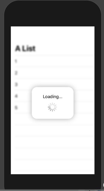
To test it, you can use this example code:
struct ContentView: View {

    var body: some View {
        LoadingView(isShowing: .constant(true)) {
            NavigationView {
                List(["1", "2", "3", "4", "5"], id: \.self) { row in
                    Text(row)
                }.navigationBarTitle(Text("A List"), displayMode: .large)
            }
        }
    }

}
Result: