I recommend this solution by antfu, which is IMO by far the best approach to work with any kind of icons: https://github.com/antfu/unplugin-icons
Check the more in-depth article explaining why and how the whole thing works.
Here’s a quick way on how to use it with Nuxt3, first off the requirements:
- be sure to use Node v16 or later
- start a new Nuxt3 project:
pnpm dlx nuxi init nuxt3-unplugin-icons - I’m using PNPM, so
pnpm i --shamefully-hoist - add the aforementioned package with
pnpm add -D unplugin-icons
Get this in your nuxt.config.ts file
// @ts-nocheck
import { defineNuxtConfig } from 'nuxt'
import Icons from 'unplugin-icons/vite'

export default defineNuxtConfig({
  vite: {
    plugins: [
      Icons({
        // the feature below is experimental ⬇️
        autoInstall: true
      })
    ]
  }
})
I don’t know how to fix the types, so I just ignored the check here.
Once done, you can go to icones.js and look for your specific icon, click on it and you’ll see this
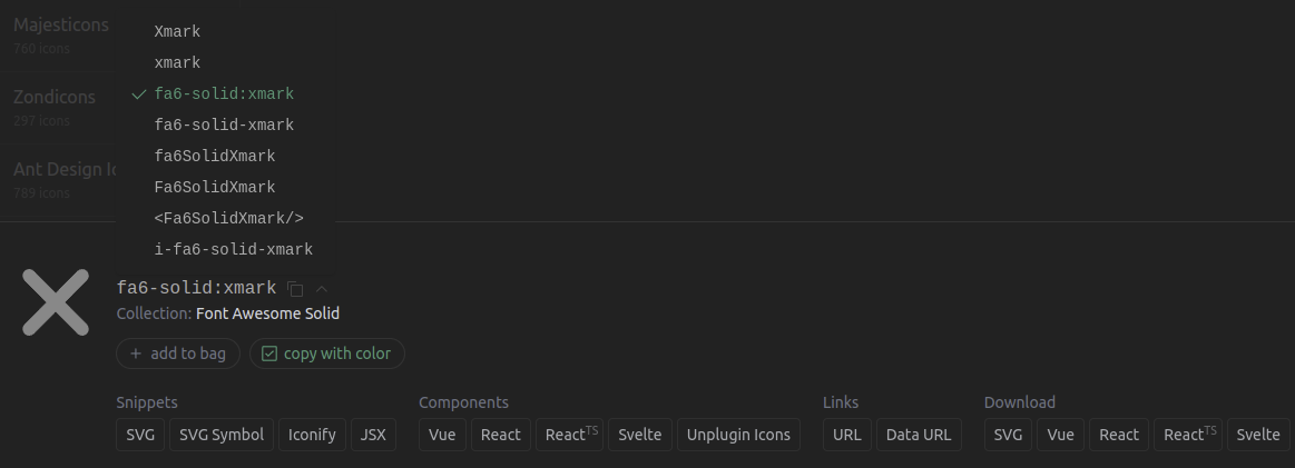
Pay attention to the format being [collection-id]:[name], so in your case it’s fa6-solid:xmark.
Now you can go to any .vue file and to convert your fa6-solid:xmark format into ~icons/fa6-solid/xmark while importing it.
<script setup>
import IconXmark from `~icons/fa6-solid/xmark`
</script>

<template>
  <icon-xmark style="font-size: 2em; color: blue" />
</template>
Your Nuxt3 project will now be able to auto-install the related package for you.
And that’s all! 🎉
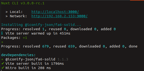
This autoInstall feature works most of the time but is not 100% battle-tested.
I’ve noticed that it is only able to install 2 icon packs at the same time (a simple restart of the server fixed the issue tho).
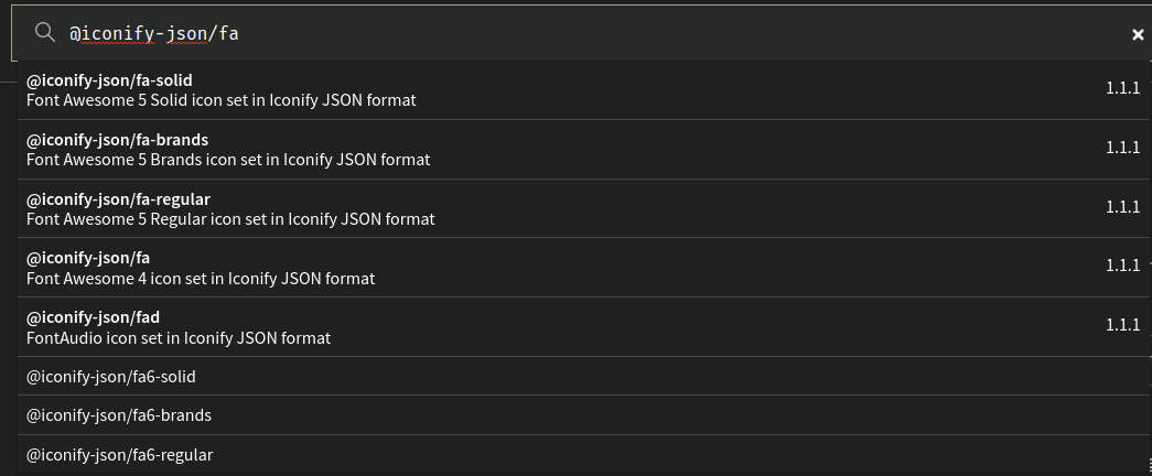
If the auto install feature failed, you can always go to npm and look for @iconify-json/[your collection id] aka @iconify-json/fa6-solid in your case.
NPM is quite good at suggestion the good one from what I’ve seen.
Here’s an example on how to use some other icons
<script setup>
import IconXmark from '~icons/fa6-solid/xmark'
import IconAccountBox from '~icons/mdi/account-box'
import TastyPizza from '~icons/noto-v1/pizza'
import IconPs from '~icons/ri/playstation-line'
</script>

<template>
  <icon-xmark style="font-size: 2em; color: blue" />
  <icon-account-box style="font-size: 2em; color: red" />
  <tasty-pizza style="font-size: 2em" />
  <icon-ps style="font-size: 2em" />
</template>
And the actual result, totally customizable with CSS as you can see

You can check my github repo for a fully working example in case it’s needed.
PS: an auto-import feature is in the works. Feel free to subscribe to the Github PR for more updates.
PS2: that one could even be used with dynamic components if you have a pre-defined array of possible icons so that the bundler can know them in advance thanks to an analytical read.