You can achieve a transparent cut out circle with 2 different techniques :
1.SVG
The following examples use an inline svg. The first snippet uses the mask element to cut out the transparent circle and the second hollow circle is made with a path element. The circle is made with 2 arc commands :
With the mask element :
body{background:url('https://farm9.staticflickr.com/8760/17195790401_ceeeafcddb_o.jpg');background-size:cover;}<svg viewbox="0 0 100 50" width="100%">
<defs>
<mask id="mask" x="0" y="0" width="80" height="30">
<rect x="5" y="5" width="90" height="40" fill="#fff"/>
<circle cx="50" cy="25" r="15" />
</mask>
</defs>
<rect x="0" y="0" width="100" height="50" mask="url(#mask)" fill-opacity="0.7"/>
</svg>With one path element :
body{background: url('https://farm9.staticflickr.com/8760/17195790401_ceeeafcddb_o.jpg');background-size:cover;}
svg{
  display:block;
  width:70%;
  height:auto;
  margin:0 auto;
}
path{
  transition:fill .5s;
  fill:#E3DFD2;
}
path:hover{
  fill:pink;
}
<svg viewbox="-10 -1 30 12">
<path d="M-10 -1 H30 V12 H-10z M 5 5 m -5, 0 a 5,5 0 1,0 10,0 a 5,5 0 1,0 -10,0z"/>
</svg>The main advantages of using SVG in this case are :
- Shorter code
- You can easily use an image or gradient to fill the circle mask
- maintain the boundaries of the shape and trigger mouse envents only over the fill respecting the mask (hover the transparent cut out circle in the example)
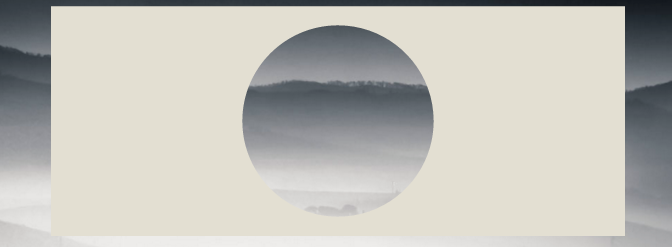
- CSS only using BOX-SHADOWS
Create a div with overflow:hidden; and a round pseudo element inside it with border-radius. Give it a huge box-shadow and no background :
div{
    position:relative;
    width:500px; height:200px;
    margin:0 auto;
    overflow:hidden;
}
div:after{
    content:'';
    position:absolute;
    left:175px; top:25px;
    border-radius:100%;
    width:150px; height:150px;
    box-shadow: 0px 0px 0px 2000px #E3DFD2;
}

body{background: url('https://farm9.staticflickr.com/8760/17195790401_ceeeafcddb_o.jpg');background-size:cover;}<div></div>Browser support for box-shadows is IE9+ see canIuse
The same approach would be to use border instead of box-shadows. It is interesting if you need to support browsers that don’t support box-shadows like IE8. The technique is the same but you need to compensate with the top and left values to keep the circle in the center of the div :
body{
    background: url('https://farm9.staticflickr.com/8760/17195790401_ceeeafcddb_o.jpg');
    background-size:cover;
}
div{
    position:relative;
    width:500px; height:200px;
    margin:0 auto;
    overflow:hidden;
}
div:after{
    content:'';
    position:absolute;
    left:-325px; top:-475px;
    border-radius:100%;
    width:150px; height:150px;
    border:500px solid #E3DFD2;
}
<div></div>