A quick test case shows that Chrome, at least, fetches all the stylesheets no matter what the media query says. This isn’t really surprising as users can resize windows. It holds true for device-width as well though.
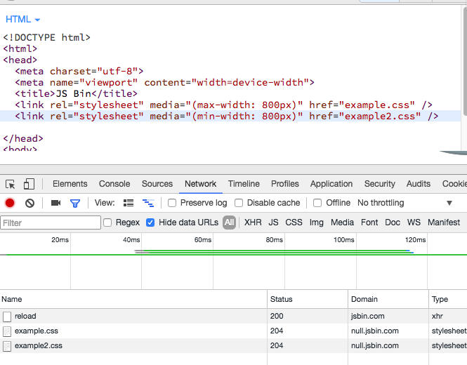
So there are no savings at all since all the stylesheets are downloaded.
This comes with the additional code of extra HTTP requests.
There are only negative performance implications.