layout compatibility is very important part of any project
sorry but you have to use dimens for handle this problem.
and i think best way for design is use density.
you can use dimens-hdpi or dimens-mdpi or …
and can use dimens-small or dimens-large or …
and can use both of them together. like dimens-larg-mdpi
but this is so hard to design.
i using dimens smallest screen width
this use density and i think you can handle all of phones or tablets by 4 or 5 dimens.
like this picture.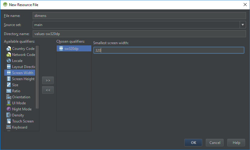
Typical numbers for screen width dp are:
- 320: a phone screen (240×320 ldpi, 320×480 mdpi, 480×800 hdpi, etc).
- 480: a tweener tablet like the Streak (480×800 mdpi).
- 600: a 7” tablet (600×1024).
- 720: a 10” tablet (720×1280, 800×1280, etc).
- if you have a device don’t support by one of these you can add
another smallest screen width for that.
you can read more details here , here , here and this help you know your phone pixels per inch.
example:
you have a phone 1080*1920 pixel and 5″ size.
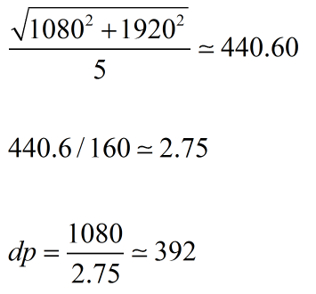
- first formula help you calculate pixel per inch (dpi).
- second formula help you calculate Pixel ratio.
- and last formula help you calculate dp.
this phone have 392 dp in width and smallest width for that is 320.
if you like use dpi Pixel ratio can help you.
- ldpi => Pixel ratio = 0.75
- mdpi => Pixel ratio = 1.0
- hdpi => Pixel ratio = 1.5
- xhdpi => Pixel ratio = 2
- xxhdpi => Pixel ratio = 3
- xxxhdpi => Pixel ratio = 4