I made some changes in formatter: "actions" to simplify implementing of your scenario. The demo shows how to use new features. It displays the grid like on the picture below
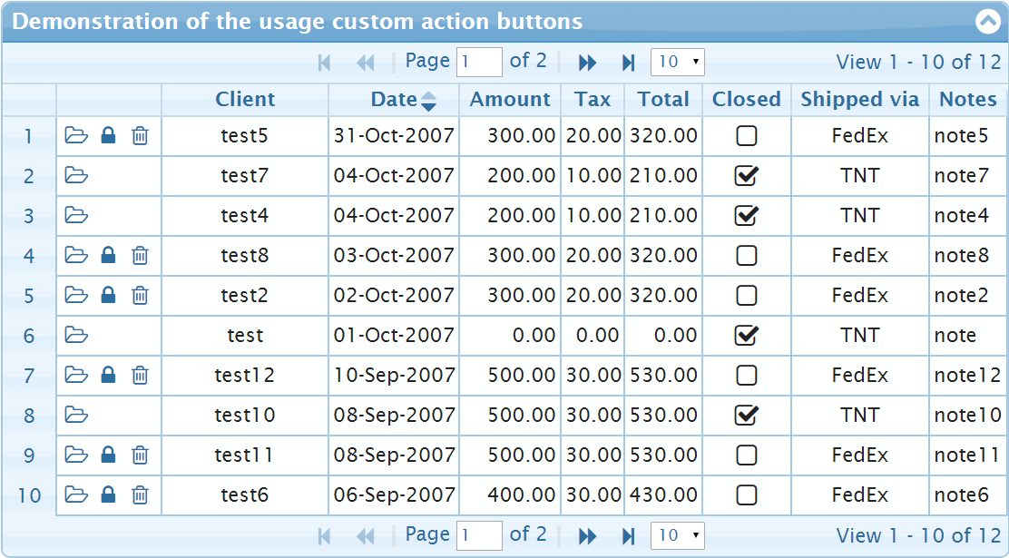
The demo defines Action columns in colModel as
{ name: "act", template: "actions", align: "left", width: 58 }, // 58 = 2 + 18*3 + 2
and it uses actionsNavOptions (one can use formatoptions alternatively) to configure the options of formatter: "actions":
actionsNavOptions: {
    editbutton: false,
    custom: [
        { action: "open", position: "first",
            onClick: function (options) {
                alert("Open, rowid=" + options.rowid);
            } },
        { action: "post", position: "first",
            onClick: function (options) {
                alert("Post, rowid=" + options.rowid);
            } }
    ],
    posticon: "fa-lock",
    posttitle: "Confirm (F2)",
    openicon: "fa-folder-open-o",
    opentitle: "Open (Enter)",
    isDisplayButtons: function (options, rowData) {
        if (options.rowData.closed) { // or rowData.closed
            return { post: { hidden: true }, del: { display: false } };
        }
    }
}
Array custom defined action name, position and the onClick callback. To define the icon and the title (the tooltip) of the custom button one should specify the options close to the options of navigator bar. The properties which specify the icon class will be constructed from the action name (open and post in the example above) and the suffix "icon" in the same way will be defined the value of title attribute for the button.
The callback isDisplayButtons allows to inform jqGrid about displaying of the buttons based on the data of the row and the rowid. The options parameter is the same options which you knows from custom formatter. options.rowId is the rowid for example. The latest version of free jqGrid (post 4.8) extended the options by including rowData. You can see that the second parameter of isDisplayButtons is already rowData. The main difference between options.rowData and rowData if the format of data. In case of usage XML input rowData parameter is XML item of input data. On the other side the option options.rowData is object with properties like name properties in colModel. Especially in case of usage loadonce: true scenario with XML data the usage of options.rowData have advantages. In the above demo options.rowData and rowData are identical.
The callback isDisplayButtons should return object with the same properties as the action names { post: {...}, open: {...}, del: {...}, edit: {...}, save: {...}, cancel: {} }. The properties of every such object can be
hidden: true– means including the button in the column but making it hidden. One can show the button later. Thesaveandcancelbuttons are hidden by default.display: false– means don’t include the button at all. Returningdel: {display: false}for example have the same effect like the optiondelbutton: false, butdel: {display: false}works only for one row.noHovering: truecan be used to remove hovering effect (onmouseover="jQuery(this).addClass('ui-state-hover');" onmouseout="jQuery(this).removeClass('ui-state-hover');") from the specified action button.