I really enjoyed the solutions posted above, but I don’t like the fact that the TabBar is not hiding according to the view transition.
In practice, when you swipe left to navigate back when using tabBar.isHidden, the result is not acceptable.
I decided to give up the native SwiftUI TabView and code my own.
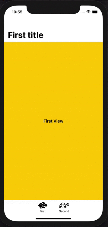
The result is more beautiful in the UI:
Here is the code used to reach this result:
First, define some views:
struct FirstView: View {
    var body: some View {
        NavigationView {
            VStack {
                Text("First View")
                    .font(.headline)
            }
            .navigationTitle("First title")
            .frame(minWidth: 0, maxWidth: .infinity, minHeight: 0, maxHeight: .infinity, alignment: .center)
            .background(Color.yellow)
        }
    }
}

struct SecondView: View {
    var body: some View {
        VStack {
            NavigationLink(destination: ThirdView()) {
                Text("Second View, tap to navigate")
                    .font(.headline)
            }
        }
        .navigationTitle("Second title")
        .frame(minWidth: 0, maxWidth: .infinity, minHeight: 0, maxHeight: .infinity, alignment: .center)
        .background(Color.orange)
    }
}

struct ThirdView: View {
    var body: some View {
        VStack {
            Text("Third View with tabBar hidden")
                .font(.headline)
        }
        .frame(minWidth: 0, maxWidth: .infinity, minHeight: 0, maxHeight: .infinity, alignment: .center)
        .background(Color.red.edgesIgnoringSafeArea(.bottom))
    }
}
Then, create the TabBarView (which will be the root view used in your app):
struct TabBarView: View {
    enum Tab: Int {
        case first, second
    }

    @State private var selectedTab = Tab.first

    var body: some View {
        VStack(spacing: 0) {
            ZStack {
                if selectedTab == .first {
                    FirstView()
                }
                else if selectedTab == .second {
                    NavigationView {
                        VStack(spacing: 0) {
                            SecondView()
                            tabBarView
                        }
                    }
                }
            }
            .animation(nil)

            if selectedTab != .second {
                tabBarView
            }
        }
    }

    var tabBarView: some View {
        VStack(spacing: 0) {
            Divider()

            HStack(spacing: 20) {
                tabBarItem(.first, title: "First", icon: "hare", selectedIcon: "hare.fill")
                tabBarItem(.second, title: "Second", icon: "tortoise", selectedIcon: "tortoise.fill")
            }
            .padding(.top, 8)
        }
        .frame(height: 50)
        .background(Color.white.edgesIgnoringSafeArea(.all))
    }

    func tabBarItem(_ tab: Tab, title: String, icon: String, selectedIcon: String) -> some View {
        ZStack(alignment: .topTrailing) {
            VStack(spacing: 3) {
                VStack {
                    Image(systemName: (selectedTab == tab ? selectedIcon : icon))
                        .font(.system(size: 24))
                        .foregroundColor(selectedTab == tab ? .primary : .black)
                }
                .frame(width: 55, height: 28)

                Text(title)
                    .font(.system(size: 11))
                    .foregroundColor(selectedTab == tab ? .primary : .black)
            }
        }
        .frame(width: 65, height: 42)
        .onTapGesture {
            selectedTab = tab
        }
    }
}
This solution also allows a lot of customization in the TabBar.
You can add some notifications badges, for example.