No, there’s nothing to mandate that the bootstrap grid must add up to 12 columns.
It’s just a preference / stylistic thing.
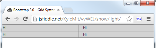
Less than 12 Columns -> Aligns Left:
If you have less than twelve of the columns filled, by default they will left align, leaving empty space to the right.
The following code:
<div class="row">
    <div class="col-xs-2">Hi</div>
    <div class="col-xs-2">Hi</div>
</div>
.row > div {
    background: lightgrey;
    border: 1px solid grey;
}
Results in this: (Demo in Fiddle)

More than 12 Columns -> Wraps:
If the total adds to more than 12 columns, as long as the columns are within a row class, they will just wrap to additional rows. A good use case would be a photo grid system where you would like to add tons of photos but don’t know how many rows you’ll have and would still like to define the number of columns.
The following code:
<div class="row">
    <div class="col-xs-6">Hi</div>
    <div class="col-xs-6">Hi</div>
    <div class="col-xs-6">Hi</div>
    <div class="col-xs-6">Hi</div>
</div>
Results in this: (Demo in Fiddle)
Other than that, sometimes it’s the case that 12 column layouts look better, but you don’t have to use them; it’s not a sudoku 🙂