Just modify the background-position like in the below snippet to get the required output. This works fine in Firefox, Chrome, Opera, IE11 and Edge.
body {
  background-image: linear-gradient(45deg, #808080 25%, transparent 25%), linear-gradient(-45deg, #808080 25%, transparent 25%), linear-gradient(45deg, transparent 75%, #808080 75%), linear-gradient(-45deg, transparent 75%, #808080 75%);
  background-size: 20px 20px;
  background-position: 0 0, 0 10px, 10px -10px, -10px 0px;
}
The problem seems to be happening because of a difference in the way the angles are handled by the -moz linear gradient and the standard one. -45deg in the -moz linear gradient seems to be equal to 135deg in the standard gradient (but changing the angle is resulting in a strange dot in the middle).
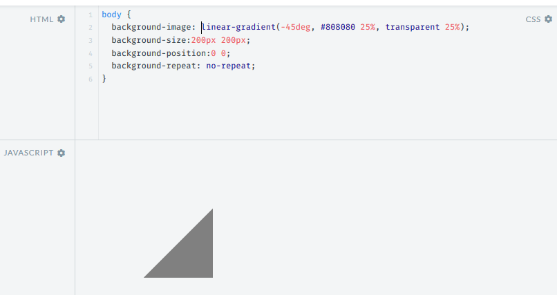
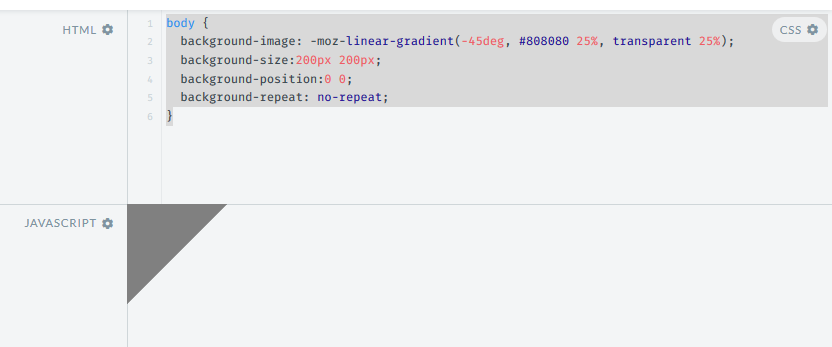
The below screenshots show the difference (both taken in the latest Firefox v44.0).
Output with -moz-linear-gradient:
Output with linear gradient: