According to the CSS basic box model, an element’s width and height are applied to its content box. Padding falls outside of that content box and increases the element’s overall size.
As a result, if you set an element with padding to 100% width, its padding will make it wider than 100% of its containing element. In your context, inputs become wider than their parent.
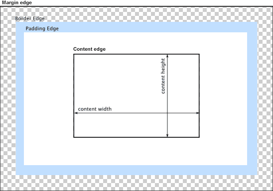
You can change the way the box model treats padding and width. Set the box-sizing CSS property to border-box to prevent padding from affecting an element’s width or height:
border-box : The width and height properties include the padding and border, but not the margin… Note that padding and border will be inside of the box.
Note the browser compatibility of box-sizing (IE8+).
At the time of this edit, no prefixes are necessary.
Paul Irish and Chris Coyier recommend the “inherited” usage below:
html {
  box-sizing: border-box;
}
*, *:before, *:after {
  box-sizing: inherit;
}
For reference, see:
* { Box-sizing: Border-box } FTW
Inheriting box-sizing Probably Slightly Better Best-Practice.
Here’s a demonstration in your specific context:
#mainContainer {
  line-height: 20px;
  font-family: "Helvetica Neue", Helvetica, Arial, sans-serif;
  background-color: rgba(0, 50, 94, 0.2);
  margin: 20px auto;
  display: table;
  -moz-border-radius: 15px;
  border-style: solid;
  border-color: rgb(40, 40, 40);
  border-radius: 2px 5px 2px 5px / 5px 2px 5px 2px;
  border-radius: 2px;
  border-radius: 2px 5px / 5px;
  box-shadow: 0 5px 10px 5px rgba(0, 0, 0, 0.2);
}
.loginForm {
  width: 320px;
  height: 250px;
  padding: 10px 15px 25px 15px;
  overflow: hidden;
}
.login-fields > .login-bottom input#login-button_normal {
  float: right;
  padding: 2px 25px;
  cursor: pointer;
  margin-left: 10px;
}
.login-fields > .login-bottom input#login-remember {
  float: left;
  margin-right: 3px;
}
.spacer {
  padding-bottom: 10px;
}
input[type=text],
input[type=password] {
  width: 100%;
  height: 30px;
  padding: 5px 10px;
  background-color: rgb(215, 215, 215);
  line-height: 20px;
  font-size: 12px;
  color: rgb(136, 136, 136);
  border-radius: 2px 2px 2px 2px;
  border: 1px solid rgb(114, 114, 114);
  box-shadow: 0 1px 0 rgba(24, 24, 24, 0.1);
  box-sizing: border-box;
}
input[type=text]:hover,
input[type=password]:hover,
label:hover ~ input[type=text],
label:hover ~ input[type=password] {
  background: rgb(242, 242, 242);
  !important;
}
input[type=submit]:hover {
  box-shadow: inset 0 1px 0 rgba(255, 255, 255, 0.3), inset 0 -10px 10px rgba(255, 255, 255, 0.1);
}
.login-top {
  height: auto;/*85px;*/
}
.login-bottom {
  padding: 35px 15px 0 0;
}
<div id="mainContainer">
<div id="login" class="loginForm">
<div class="login-top">
</div>
<form class="login-fields" onsubmit="alert('test'); return false;">
<div id="login-email" class="login-field">
<label for="email" style="-moz-user-select: none;-webkit-user-select: none;" onselectstart="return false;">E-mail address</label>
<span><input name="email" id="email" type="text" /></span>
</div>
<div class="spacer"></div>
<div id="login-password" class="login-field">
<label for="password" style="-moz-user-select: none;-webkit-user-select: none;" onselectstart="return false;">Password</label>
<span><input name="password" id="password" type="password" /></span>
</div>
<div class="login-bottom">
<input type="checkbox" name="remember" id="login-remember" />
<label for="login-remember" style="-moz-user-select: none;-webkit-user-select: none;" onselectstart="return false;">Remember my email</label>
<input type="submit" name="login-button" id="login-button_normal" style="cursor: pointer" value="Log in" />
</div>
</form>
</div>
</div>Alternatively, rather than adding padding to the <input> elements themselves, style the <span> elements wrapping the inputs. That way, the <input> elements can be set to width:100% without being affected by any additional padding. Example below:
#login-form {
  font-family: "Helvetica Neue", Helvetica, Arial, sans-serif;
  background-color: rgba(0, 50, 94, 0.2);
  margin: 20px auto;
  padding: 10px 15px 25px 15px;
  border: 4px solid rgb(40, 40, 40);
  box-shadow: 0 5px 10px 5px rgba(0, 0, 0, 0.2);
  border-radius: 2px;
  width: 320px;
}
label span {
  display: block;
  padding: .3em 1em;
  background-color: rgb(215, 215, 215);
  border-radius: .25em;
  border: 1px solid rgb(114, 114, 114);
  box-shadow: 0 1px 0 rgba(24, 24, 24, 0.1);
  margin: 0 0 1em;
}
label span:hover {
  background: rgb(242, 242, 242);
  box-shadow: inset 0 1px 0 rgba(255, 255, 255, 0.3), inset 0 -10px 10px rgba(255, 255, 255, 0.1);
}
input[type=text],
input[type=password] {
  background: none;
  border: none;
  width: 100%;
  height: 2em;
  line-height: 2em;
  font-size: 12px;
  color: rgb(136, 136, 136);
  outline: none;
}
.login-bottom {
  margin: 2em 1em 0 0;
}
input#login-button {
  float: right;
  padding: 2px 25px;
}
input#login-remember {
  float: left;
  margin-right: 3px;
}
<form id="login-form">
<label>E-mail address
<span><input name="email" type="text" /></span>
</label>
<label>Password
<span><input name="password" type="password" /></span>
</label>
<div class="login-bottom">
<label>
<input type="checkbox" name="remember" id="login-remember" />Remember my email
</label>
<input type="submit" name="login-button" id="login-button" value="Log in" />
</div>
</form>