I use this to get the popular frosted glass effect. Until someone successfully invents a good polyfill for backdrop-filter I’m using a slightly transparent background as a fallback:
/* slightly transparent fallback */
.backdrop-blur {
  background-color: rgba(255, 255, 255, .9);
}

/* if backdrop support: very transparent and blurred */
@supports ((-webkit-backdrop-filter: none) or (backdrop-filter: none)) {
  .backdrop-blur {
    background-color: rgba(255, 255, 255, .5);
    -webkit-backdrop-filter: blur(2em);
    backdrop-filter: blur(2em);
  }
}
The filter will work in currently supported browsers. (Safari and Chrome with experimental Web Platform features enabled) The code should also work in future browsers that support unprefixed backdrop-filter if the spec doesn’t change before that.
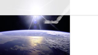
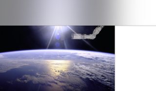
Examples without and with backdrop-filter support: