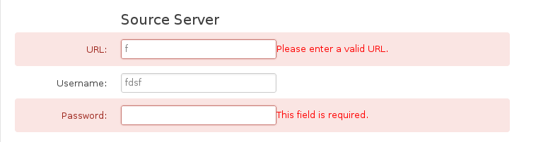
This is a hands-on example:
$('form').validate({
    errorClass:'error',
    validClass:'success',
    errorElement:'span',
    highlight: function (element, errorClass, validClass) {
        $(element).parents("div[class="clearfix"]").addClass(errorClass).removeClass(validClass);
    },
    unhighlight: function (element, errorClass, validClass) {
        $(element).parents(".error").removeClass(errorClass).addClass(validClass);
    }
});
It doesn’t really use bootstrap popovers, but it looks really nice and is easy to achieve.
UPDATE
So, to have popover validation you can use this code:
$("form").validate({
  rules : {
    test : {
      minlength: 3 ,
      required: true
    }
  },
  showErrors: function(errorMap, errorList) {
    $.each(this.successList, function(index, value) {
      return $(value).popover("hide");
    });
    return $.each(errorList, function(index, value) {
      var _popover;
      _popover = $(value.element).popover({
        trigger: "manual",
        placement: "top",
        content: value.message,
        template: "<div class=\"popover\"><div class=\"arrow\"></div><div class=\"popover-inner\"><div class=\"popover-content\"><p></p></div></div></div>"
      });
      // Bootstrap 3.x :
      //_popover.data("bs.popover").options.content = value.message;
      // Bootstrap 2.x :
      _popover.data("popover").options.content = value.message;
      return $(value.element).popover("show");
    });
  }
});
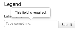
You get something like this:
Check out the jsFiddle.