This is possible, and it does not require extra markup, but uses an ::after pseudo-element.
It involves putting a pseudo-element with a gradient background below and clipping that. This works in all current browsers without vendor prefixes or hacks (even IE), but if you want to support vintage versions of IE, you should either consider solid color fallbacks, javascript, and/or custom MSIE CSS extensions (i.e., filter, CSSPie-like vector trickery, etc).
Here’s a live example (jsfiddle version):
@import url('//raw.githubusercontent.com/necolas/normalize.css/master/normalize.css');

html {
    /* just for showing that background doesn't need to be solid */
    background: linear-gradient(to right, #DDD 0%, #FFF 50%, #DDD 100%);
    padding: 10px;
}

.grounded-radiants {
    position: relative;
    border: 4px solid transparent;
    border-radius: 16px;
    background: linear-gradient(orange, violet);
    background-clip: padding-box;
    padding: 10px;
    /* just to show box-shadow still works fine */
    box-shadow: 0 3px 9px black, inset 0 0 9px white;
}

.grounded-radiants::after {
    position: absolute;
    top: -4px; bottom: -4px;
    left: -4px; right: -4px;
    background: linear-gradient(red, blue);
    content: '';
    z-index: -1;
    border-radius: 16px;
}
<p class="grounded-radiants">
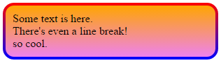
Some text is here.<br/>
There's even a line break!<br/>
so cool.
</p>The extra styling above is to show:
- This works with any background
- It works just fine with
box-shadow,insetor not - Does not require you to add the shadow to the pseudo-element
Again, this works with IE, Firefox and Webkit/Blink browsers.