Adding to @Sheridan’s answer
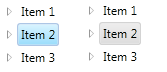
This isn’t a 100% accurate but should get you pretty close (it’s using the colors from GridView which is pretty close to Windows Explorer)
<TreeView ...>
    <TreeView.Resources>
        <LinearGradientBrush x:Key="{x:Static SystemColors.HighlightBrushKey}" EndPoint="0,1" StartPoint="0,0">
            <GradientStop Color="#FFD9F4FF" Offset="0"/>
            <GradientStop Color="#FF9BDDFB" Offset="1"/>
        </LinearGradientBrush>
        <LinearGradientBrush x:Key="{x:Static SystemColors.ControlBrushKey}" EndPoint="0,1" StartPoint="0,0">
            <GradientStop Color="#FFEEEDED" Offset="0"/>
            <GradientStop Color="#FFDDDDDD" Offset="1"/>
        </LinearGradientBrush>
        <SolidColorBrush x:Key="{x:Static SystemColors.HighlightTextBrushKey}" Color="Black" />
        <SolidColorBrush x:Key="{x:Static SystemColors.ControlTextBrushKey}" Color="Black" />
    </TreeView.Resources>
    <TreeView.ItemContainerStyle>
        <Style TargetType="{x:Type TreeViewItem}">
            <Setter Property="BorderThickness" Value="1.5"/>
            <Style.Triggers>
                <Trigger Property="IsSelected" Value="True">
                    <Setter Property="BorderBrush" Value="#adc6e5"/>
                </Trigger>
                <MultiTrigger>
                    <MultiTrigger.Conditions>
                        <Condition Property="IsSelected" Value="True"/>
                        <Condition Property="IsSelectionActive" Value="False"/>
                    </MultiTrigger.Conditions>
                    <Setter Property="BorderBrush" Value="LightGray"/>
                </MultiTrigger>
            </Style.Triggers>
            <Style.Resources>
                <Style TargetType="Border">
                    <Setter Property="CornerRadius" Value="2"/>
                </Style>
            </Style.Resources>
        </Style>
    </TreeView.ItemContainerStyle>
</TreeView>