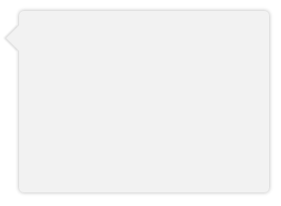
Instead of using a triangle hack, you can just rotate a div using transform and get a real box-shadow. Since you only want the shadow on one side of the div (the visible triangle side), you have to make the blur smaller and lower the opacity.
Demo: http://jsfiddle.net/ThinkingStiff/mek5Z/
HTML:
<div class="bubble"></div>
CSS:
.bubble{
    background-color: #F2F2F2;
    border-radius: 5px;
    box-shadow: 0px 0px 6px #B2B2B2;
    height: 200px;
    margin: 20px;
    width:  275px;
}

.bubble::after {
    background-color: #F2F2F2;
    box-shadow: -2px 2px 2px 0 rgba( 178, 178, 178, .4 );
    content: "\00a0";
    display: block;
    height: 20px;
    left: -10px;
    position: relative;
    top: 20px;
    transform:             rotate( 45deg );
        -moz-transform:    rotate( 45deg );
        -ms-transform:     rotate( 45deg );
        -o-transform:      rotate( 45deg );
        -webkit-transform: rotate( 45deg );
    width:  20px;
}
Output: