More Related Contents:
- Cut Corners using CSS
- Element will not stay centered, especially when re-sizing screen
- Responsive grid of hexagons
- How to create a circle with links on border side
- How to create uneven rounded sides on a div?
- Shape with a slanted side (responsive)
- CSS Cut out circle from a rectangular shape
- How to use CSS to surround a number with a circle?
- How to make a curved edge hexagon by using CSS
- html/css hexagon with image inside
- How to draw circle in html page?
- Responsive CSS Trapezoid Shape
- Hexagon shape with a border/outline
- Create a slanted edge to a div [duplicate]
- How to bevel the corner of a block div?
- Dynamically aligning pseudo element according to parent height
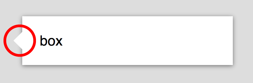
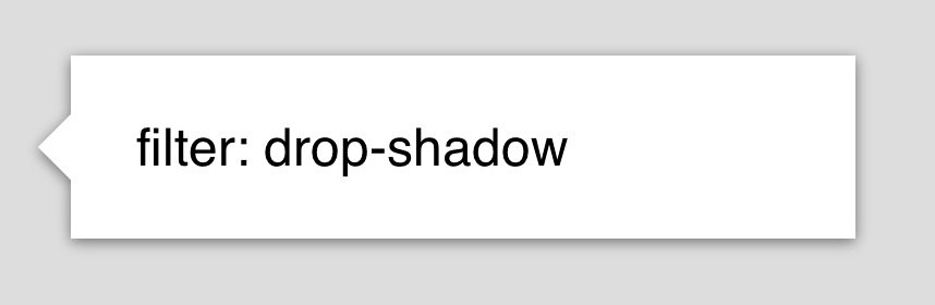
- CSS Speech Bubble with Box Shadow
- Center Triangle at Bottom of Div
- Slanted diagonal line in html or css?
- How can I make a 45 degree responsive ribbon with folded corner?
- Border with a transparent centred arrow
- Add outward curving border to elements like this: ◝◟___◞◜
- How can I make a div with irregular shapes with css3 and html5?
- Skewed Borders on a Div
- Pixelated edge around a CSS Circle with overflow: hidden;
- div with triangle at the bottom with background image
- Responsive CSS Circles
- How to create a triangle in CSS3 using border-radius
- How to create a heart shape using CSS?
- Make plus symbol in CSS