There are different approaches that can be adopted to create this shape. Below is a detailed description of possibilities:
SVG Based Approaches:
SVG is the recommended way to create such shapes. It offers simplicity and scale-ability. Below are a couple of possible ways:
1- Using Path Element:
We can use SVG‘s path element to create this shape and fill it with some solid color, gradient or a pattern.
Only one attribute d is used to define shapes in path element. This attribute itself contains a number of short commands and few parameters that are necessary for those commands to work.
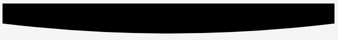
Below is the necessary code to create this shape:
<path d="M 0,0
         L 0,40
         Q 250,80 500,40
         L 500,0
         Z" />
Below is a brief description of path commands used in above code:
Mcommand is used to define the starting point. It appears at the beginning and specify the point from where drawing should start.Lcommand is used to draw straight lines.Qcommand is used to draw curves.Zcommand is used to close the current path.
Output Image:
Working Demo:
svg {
  width: 100%;
}
<svg width="500" height="80" viewBox="0 0 500 80" preserveAspectRatio="none">
<path d="M0,0 L0,40 Q250,80 500,40 L500,0 Z" fill="black" />
</svg>2- Clipping:
Clipping means removing or hiding some parts of an element.
In this approach, we define a clipping region by using SVG’s clipPath element and apply this to a rectangular element. Any area that is outside the clipping region will be hidden.
Below is the necessary code:
<defs>
    <clipPath id="shape">
        <path d="M0,0 L0,40 Q250,80 500,40 L500,0 Z" />
    </clipPath>
</defs>
<rect x="0" y="0" width="500" height="80" fill="#000" clip-path="url(#shape)" />
Below is brief description of the elements used in above code:
defselement is used to define element / objects for later use in SVG document.clipPathelement is used to define a clipping region.rectelement is used to create rectangles.clip-pathattribute is used to link the clipping path created earlier.
Working Demo:
svg {
  width: 100%;
}
<svg width="500" height="80" viewBox="0 0 500 80" preserveAspectRatio="none">
<defs>
<clipPath id="shape">
<path d="M0,0 L0,40 Q250,80 500,40 L500,0 Z" />
</clipPath>
</defs>
<rect x="0" y="0" width="500" height="80" fill="#000" clip-path="url(#shape)" />
</svg>CSS Based Approaches:
1- Using Pseudo Element:
We can use ::before or ::after pseudo element to create this shape. Steps to create this are given below:
- Create a layer with
::beforeOR::afterpseudo element having width and height more than its parent. - Add
border-radiusto create the rounded shape. - Add
overflow: hiddenon parent to hide the unnecessary part.
Required HTML:
All we need is a single div element possibly having some class like shape:
<div class="shape"></div>
Working Demo:
.shape {
  position: relative;
  overflow: hidden;
  height: 80px;
}

.shape::before {
  border-radius: 100%;
  position: absolute;
  background: black;
  right: -200px;
  left: -200px;
  top: -200px;
  content: '';
  bottom: 0;
}
<div class="shape"></div>2- Radial Gradient:
In this approach we will use CSS3’s radial-gradient() function to draw this shape on the element as a background. However, this approach doesn’t produce very sharp image and it might have some jagged corners.
Required HTML:
Only single div element with some class will be required i.e.
<div class="shape"></div>
Necessary CSS:
.shape {
  background-image: radial-gradient(120% 120px at 50% -30px, #000 75%, transparent 75%);
}
Working Demo:
.shape {
  background: radial-gradient(120% 120px at 50% -30px, #000 75%, transparent 75%) no-repeat;
  height: 80px;
}
<div class="shape"></div>JavaScript Based Approaches:
Although not required in this case but for the sake of completeness, I’m adding this approach as well. This can be useful in some cases as well:
HTML5 Canvas:
We can draw this shape on HTML5 Canvas element using path functions:
var canvas = document.getElementById('canvas');
var ctx = canvas.getContext('2d');

ctx.beginPath();
ctx.moveTo(0, 0);
ctx.lineTo(0, 40);
ctx.quadraticCurveTo(311, 80, 622, 40);
ctx.lineTo(622, 0);
ctx.fill();
<canvas id="canvas" width="622" height="80"></canvas>Below is a brief description of the methods used in above code:
beginPath()is used to create a new path. Once a new path is created, future drawing commands are directed into the path.moveTo(x, y)moves the pen to the coordinates specified byxandy.lineTo(x, y)draws a straight line from the current pen position to the point specified byxandy.quadraticCurveTo(cp1x, cp1y, x, y)draws a curve from current pen position to the point specified byxandyusing control point specified bycp1xandcp1y.fill()fills the current path using non-zero or even-odd winding rule.
Useful Resources: