Border-radius :
First, you need to understand that the border-radius property takes 2 values. These values are the radii on the X/Y axis of a quarter ellipse defining the shape of the corner.
If only one of the values is set then the second value is equal to the first one. So border-radius: x is equivalent to border-radius:x/x;.
Percentages values
Refering to the W3C specs : CSS Backgrounds and Borders Module Level 3 border-radius property this is what we can read concerning percentage values:
Percentages: Refer to corresponding dimension of the border box.
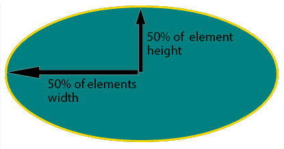
So border-radius:50%; defines the raddi of the ellipse this way :
- the radii on the X axis is 50% of the containers width
- the radii on the Y axis is 50% of the containers height
Pixel and other units
Using one value other than a percentage for border radius (em, in, viewport related units, cm…) will always result in an ellipse with the same X/Y radii. In other words, a circle.
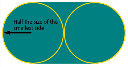
When you set border-radius:999px; the radii of the circle should be 999px. But another rule is applied when the curves overlap reducing the radii of the circle to half the size of the smallest side. So in your example it is equal to half the height of the element : 50px.
For this example (with a fixed size element) you can obtain the same result with both px and percentages. As the element is 230px x 100px, border-radius: 50%; is equivalent to border-radius:115px/50px; (50% of both sides) :
div {
  display: inline-block;
  background: teal;
  width: 230px;
  height: 100px;
  padding: 40px 10px;
  box-sizing: border-box;
  font-family: courier;
  font-size: 0.8em;
  color: #fff;
}
.percent {
  border-radius: 50%;
}
.pixels {
  border-radius: 115px/50px;
}
<div class="percent">border-radius:50%;</div>
<div class="pixels">border-radius:115px/50px;</div>