There are several approaches to make a transparent arrow over an image with CSS. The two I will describe involve pseudo elements to minimize markup and have the same output. You can also see an SVG approach at the end of this answer :
The transparent effect on the black part arround the arrow is made with rgba() colors that allow transparency. But you can use opacity on the pseudo elements if you prefer.
1. SkewX()
You can use the CSS3 skewX() property on two pseudo elements to make the transparent arrow. The main asset of this approach is that the transparent arrow can be responsive but it also allows you to put a border on the black shape and around the traingle.
The responsiveness of the shape is made with the padding-bottom property to maintain it’s aspect ratio (this technique is described here).
.wrap {
position: relative;
overflow: hidden;
width: 70%;
margin: 0 auto;
}
.wrap img {
width: 100%;
height: auto;
display: block;
}
.arrow {
position: absolute;
bottom: 0;
width: 100%;
padding-bottom: 3%;
background-color: rgba(0, 0, 0, 0.8);
}
.arrow:before,
.arrow:after {
content: '';
position: absolute;
bottom: 100%;
width: 50%;
padding-bottom: inherit;
background-color: inherit;
}
.arrow:before {
right: 50%;
-ms-transform-origin: 100% 100%;
-webkit-transform-origin: 100% 100%;
transform-origin: 100% 100%;
-ms-transform: skewX(45deg);
-webkit-transform: skewX(45deg);
transform: skewX(45deg);
}
.arrow:after {
left: 50%;
-ms-transform-origin: 0 100%;
-webkit-transform-origin: 0 100%;
transform-origin: 0 100%;
-ms-transform: skewX(-45deg);
-webkit-transform: skewX(-45deg);
transform: skewX(-45deg);
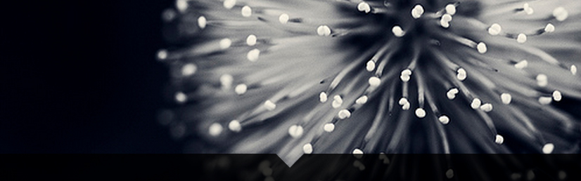
}<div class="wrap">
<img src="https://farm8.staticflickr.com/7187/6895047173_d4b1a0d798.jpg" />
<div class="arrow"></div>
</div>Browser support for the transform : skew() property is IE9+ (see canIuse).
2. Border
The asset of this technique is browser support so if you need IE8 support this one is for you. The drawback is that the shape can’t be responsive because border can’t use % widths.
.wrap {
position: relative;
overflow: hidden;
width: 70%;
margin: 0 auto;
}
.wrap img {
width: 100%;
height: auto;
display: block;
}
.arrow {
position: absolute;
bottom: 0;
width: 100%;
height: 20px;
background-color: rgba(0, 0, 0, 0.8);
}
.arrow:before,
.arrow:after {
content: '';
position: absolute;
bottom: 100%;
width: 50%;
box-sizing: border-box;
}
.arrow:before {
right: 50%;
border-bottom: 20px solid rgba(0, 0, 0, 0.8);
border-right: 20px solid transparent;
}
.arrow:after {
left: 50%;
border-bottom: 20px solid rgba(0, 0, 0, 0.8);
border-left: 20px solid transparent;
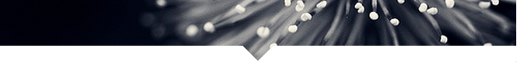
}<div class="wrap">
<img src="https://farm8.staticflickr.com/7187/6895047173_d4b1a0d798.jpg" />
<div class="arrow"></div>
</div>3. Play with it!
Example : if you can change the black transparent color to the same as your background color (white here), you can make an transparent triangle/arrow with the same background image as the block :
.wrap {
    position: relative;
    overflow: hidden;
    width: 50%;
    margin: 0 auto;
    background-color:#fff;
}
.wrap img {
    width: 100%;
    height: auto;
    display: block;
}
.wrap:before, .wrap:after {
    content:'';
    position: absolute;
    bottom: 0;
    width: 50%;
    background-color: inherit;
    padding-bottom:3%;
}
.wrap:before {
    right: 50%;
    -ms-transform-origin: 100% 100%;
    -webkit-transform-origin: 100% 100%;
    transform-origin: 100% 100%;
    -ms-transform: skewX(45deg);
    -webkit-transform: skewX(45deg);
    transform: skewX(45deg);
}
.wrap:after {
    left: 50%;
    -ms-transform-origin: 0 100%;
    -webkit-transform-origin: 0 100%;
    transform-origin: 0 100%;
    -ms-transform: skewX(-45deg);
    -webkit-transform: skewX(-45deg);
    transform: skewX(-45deg);
}
<div class="wrap">
<img src="https://farm8.staticflickr.com/7187/6895047173_d4b1a0d798.jpg" />
</div>4. Tooltip with a triangle over an image.
If you need to use this shape over another image, background gradient or whatever non plain color, you will need to use a different approach in order to see the image all around the shape like this:
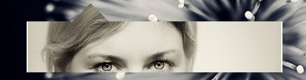
The point is to use the same image twice. Once in the div element and once in the triangle and to postion them exactly at the same place with absolute positioning. The arrow is made with transform:rotate();.
body{
  padding-top:100px;
  background:url('https://farm8.staticflickr.com/7187/6895047173_d4b1a0d798.jpg')no-repeat center center;
  background-size:cover;
}

.wrap, .img {
  display:inline-block;
  position:relative;
}
.tr{
  position:absolute;
  overflow:hidden;
  top:-25px; left:100px;
  width:50px; height:50px;
  -webkit-transform:rotate(45deg);
  -ms-transform:rotate(45deg);
  transform:rotate(45deg);
}
.tr img{
  position:absolute;
  top:-15px; left:-100px;
  -webkit-transform-origin: 125px 40px;
  -ms-transform-origin: 125px 40px;
  transform-origin: 125px 40px;
  -webkit-transform:rotate(-45deg);
  -ms-transform:rotate(-45deg);
  transform:rotate(-45deg);
}
.img{
  overflow:hidden;
  width: 600px; height:100px;
}
.img img{
  position:absolute;
  top:-40px;
}
<div class="wrap">
<div class="img">
<img src="https://farm7.staticflickr.com/6092/6227418584_d5883b0948.jpg" alt="" />
</div>
<div class="tr">
<img src="https://farm7.staticflickr.com/6092/6227418584_d5883b0948.jpg" alt="" />
</div>
</div>DEMO with box shadows.
5. SVG and cliPath
DEMO using an svg tag and clipPath.
This might be a semanticaly better approach if you are making graphics.