You have your arrow centered with left:48%. This positions the arrow near the center of the container based on the arrow element’s left edge.
In other words, assume you used left:50% (which is the correct way to go), this doesn’t center the arrow element in the container. It actually centers the left edge of the element in the container.
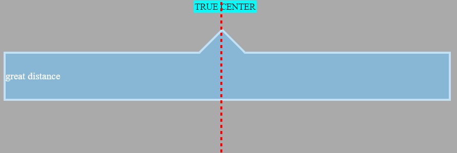
In the image below a marker is centered on the page using text-align:center.
For comparison, see your arrow centered with left:50%.
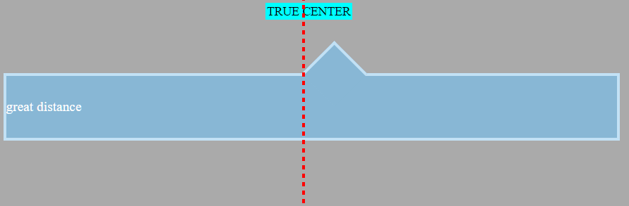
The element is positioned center-right. This misalignment becomes more noticeable as the window gets smaller.
As a result, it is common to see centered, absolutely positioned elements use the transform property:
.triangle {
   position: absolute;
   left: 50%;
   transform: translate(-50%,0);
}
The transform rule tells the triangle to shift itself back by 50% of its width. This makes it perfectly centered on the line. Now it emulates text-align:center.
In translate(-50%,0), the first value targets the x-axis (horizontal), the other applies to the y-axis. An equivalent rule would be transform:translateX(-50%) (there’s also transform:translateY()).
As an aside, here’s how to center an element both horizontally and
vertically using this method:.triangle { position: absolute; left: 50%; top: 50%; transform: translate(-50%,-50%); }Note: If you were using
right: 50%orbottom: 50%, the respectivetranslatevalues would be50%(not negative).
In this particular question, however, an issue arises because transform:rotate(45deg) is also in the declaration block. Adding a second transform means the first one is ignored (per the cascade).
So, as a solution, try this:
.container::before {
    left: 50%;
    transform: translate(-50%,0) rotate(45deg);
}
By chaining functions together, multiple functions can be applied.
Just note that order matters. If translate and rotate were reversed, the triangle would first rotate 45 degrees and then shift -50% along the rotated axis, breaking the layout. So make sure that translate goes first. (Thanks @Oriol for pointing this out in the comments.)
Here’s the full code:
body {
    background: #333333;
}

.container {
    width: 98%;
    height: 80px;
    line-height: 80px;
    position: relative;
    top: 20px;
    min-width: 250px;
    margin-top: 50px;
}

.container-decor {
    border: 4px solid #C2E1F5;
    color: #fff;
    font-family: times;
    font-size: 1.1em;
    background: #88B7D5;
    text-align: justify;
}

.container::before {
    top: -33px;
    left: 50%;
    transform: translate(-50%,0) rotate(45deg);
    position: absolute;
    border: solid #C2E1F5;
    border-width: 4px 0 0 4px;
    background: #88B7D5;
    content: '';
    width: 56px;
    height: 56px;
}
<div class="container container-decor">great distance</div>