You can achieve this effect with no additional markup using pseudo-elements and the adjacent sibling selector (~):
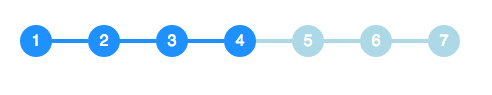
li {
  width: 2em;
  height: 2em;
  text-align: center;
  line-height: 2em;
  border-radius: 1em;
  background: dodgerblue;
  margin: 0 1em;
  display: inline-block;
  color: white;
  position: relative;
}

li::before{
  content: '';
  position: absolute;
  top: .9em;
  left: -4em;
  width: 4em;
  height: .2em;
  background: dodgerblue;
  z-index: -1;
}


li:first-child::before {
  display: none;
}

.active {
  background: dodgerblue;
}

.active ~ li {
  background: lightblue;
}

.active ~ li::before {
  background: lightblue;
}
<ul>
<li>1</li>
<li>2</li>
<li>3</li>
<li class="active">4</li>
<li>5</li>
<li>6</li>
<li>7</li>
</ul>