As described in 6. Flex Lines,
Flex items in a flex container are laid out and aligned
within flex lines, hypothetical containers used for grouping and
alignment by the layout algorithm. A flex container can be either
single-line or multi-line, depending on the flex-wrap
property
Then, you can set different alignments:
-
The
justify-contentproperty applies to all flex containers, and sets the alignment of the flex items along the main axis of each flex line.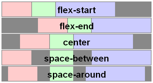
-
The
align-itemsproperty applies to all flex containers, and sets the default alignment of the flex items along the cross axis of each flex line. Thealign-selfapplies to all flex items, allows this default alignment to be overridden for individual flex items.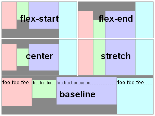
-
The
align-contentproperty only applies to multi-line flex containers, and aligns the flex lines within the flex container when there is extra space in the cross-axis.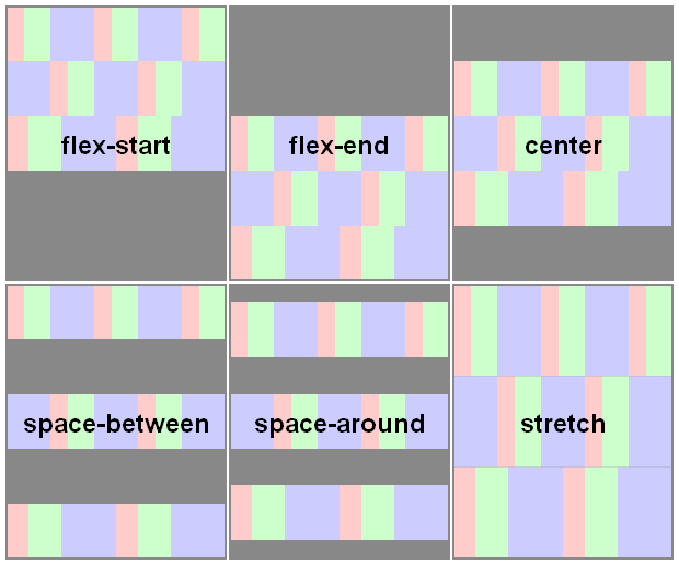


Here you have a snippet to play:
var form = document.forms[0],
    flex = document.getElementById('flex');
form.addEventListener('change', function() {
  flex.style.flexDirection = form.elements.fd.value;
  flex.style.justifyContent = form.elements.jc.value;
  flex.style.alignItems = form.elements.ai.value;
  flex.style.alignContent = form.elements.ac.value;
});
ul {
display: flex;
flex-flow: row wrap;
padding: 0;
list-style: none;
}
li {
padding: 0 15px;
}
label {
display: block;
}
#flex {
display: flex;
flex-wrap: wrap;
height: 240px;
width: 240px;
border: 1px solid #000;
background: yellow;
}
#flex > div {
min-width: 60px;
min-height: 60px;
border: 1px solid #000;
background: blue;
display: flex;
justify-content: center;
align-items: center;
color: #fff;
}
#flex > .big {
font-size: 1.5em;
min-width: 70px;
min-height: 70px;
}<form>
<ul>
<li>flex-direction
<label><input type="radio" name="fd" value="row" checked /> row</label>
<label><input type="radio" name="fd" value="row-reverse" /> row-reverse</label>
<label><input type="radio" name="fd" value="column" /> column</label>
<label><input type="radio" name="fd" value="column-reverse" /> column-reverse</label>
</li>
<li>justify-content
<label><input type="radio" name="jc" value="flex-start" checked /> flex-start</label>
<label><input type="radio" name="jc" value="flex-end" /> flex-end</label>
<label><input type="radio" name="jc" value="center" /> center</label>
<label><input type="radio" name="jc" value="space-between" /> space-between</label>
<label><input type="radio" name="jc" value="space-around" /> space-around</label>
</li>
<li>align-items
<label><input type="radio" name="ai" value="flex-start" /> flex-start</label>
<label><input type="radio" name="ai" value="flex-end" /> flex-end</label>
<label><input type="radio" name="ai" value="center" /> center</label>
<label><input type="radio" name="ai" value="baseline" /> baseline</label>
<label><input type="radio" name="ai" value="stretch" checked /> stretch</label>
</li>
<li>align-content
<label><input type="radio" name="ac" value="flex-start" /> flex-start</label>
<label><input type="radio" name="ac" value="flex-end" /> flex-end</label>
<label><input type="radio" name="ac" value="center" /> center</label>
<label><input type="radio" name="ac" value="space-between" /> space-between</label>
<label><input type="radio" name="ac" value="space-around" /> space-around</label>
<label><input type="radio" name="ac" value="stretch" checked /> stretch</label>
</li>
</ul>
</form>
<div id="flex">
<div>1</div>
<div class="big">2</div>
<div>3</div>
<div>4</div>
<div class="big">5</div>
<div>6</div>
</div>