Just create your own style that overrides the dialog Template (and add the DialogShownStoryboard too).
<Style TargetType="{x:Type Dialog:BaseMetroDialog}"
        x:Key="NewCustomDialogStyle"
        BasedOn="{StaticResource {x:Type Dialog:BaseMetroDialog}}">
    <Setter Property="Template">
        <Setter.Value>
            <ControlTemplate TargetType="{x:Type Dialog:BaseMetroDialog}">
                <ControlTemplate.Resources>
                    <Storyboard x:Key="DialogShownStoryboard">
                        <DoubleAnimation AccelerationRatio=".9"
                                            BeginTime="0:0:0"
                                            Duration="0:0:0.2"
                                            Storyboard.TargetProperty="Opacity"
                                            To="1" />
                    </Storyboard>
                </ControlTemplate.Resources>
                <Grid Background="{TemplateBinding Background}">
                    <Border FocusVisualStyle="{x:Null}"
                            Focusable="False">
                        <Grid>
                            <Grid.RowDefinitions>
                                <RowDefinition Height="Auto" />
                                <RowDefinition Height="*" />
                                <RowDefinition Height="Auto" />
                            </Grid.RowDefinitions>
                            <ContentPresenter Grid.Row="0"
                                                Content="{TemplateBinding DialogTop}" />
                            <Grid Grid.Row="1">
                                <Grid.ColumnDefinitions>
                                    <ColumnDefinition Width="10*" />
                                    <ColumnDefinition Width="80*" />
                                    <ColumnDefinition Width="10*" />
                                </Grid.ColumnDefinitions>
                                <!--  Content area  -->
                                <Grid Grid.Column="1"
                                        Margin="0 10 0 0">
                                    <Grid.RowDefinitions>
                                        <RowDefinition Height="Auto" />
                                        <RowDefinition Height="*" />
                                    </Grid.RowDefinitions>
                                    <TextBlock Grid.Row="0"
                                                FontSize="{DynamicResource DialogTitleFontSize}"
                                                Foreground="{TemplateBinding Foreground}"
                                                Text="{TemplateBinding Title}"
                                                TextWrapping="Wrap" />
                                    <ContentPresenter Grid.Row="1"
                                                        Content="{TemplateBinding Content}" />
                                </Grid>
                            </Grid>
                            <ContentPresenter Grid.Row="2"
                                                Content="{TemplateBinding DialogBottom}" />
                        </Grid>
                    </Border>
                </Grid>
                <ControlTemplate.Triggers>
                    <EventTrigger RoutedEvent="Loaded">
                        <EventTrigger.Actions>
                            <BeginStoryboard Storyboard="{StaticResource DialogShownStoryboard}" />
                        </EventTrigger.Actions>
                    </EventTrigger>
                </ControlTemplate.Triggers>
            </ControlTemplate>
        </Setter.Value>
    </Setter>
</Style>
The namespace here is
xmlns:Dialog="clr-namespace:MahApps.Metro.Controls.Dialogs;assembly=MahApps.Metro"
Now use this custom style e.g. for a custom dialog
<Dialog:CustomDialog x:Key="CustomDialogTest"
Style="{StaticResource NewCustomDialogStyle}"
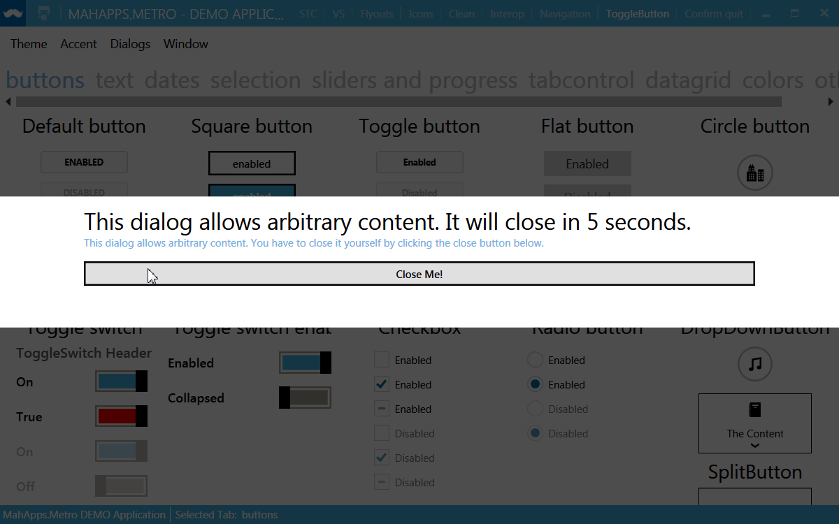
Title="This dialog allows arbitrary content. It will close in 5 seconds."
x:Name="CustomTestDialog">
<StackPanel>
<TextBlock Height="30"
Text="This dialog allows arbitrary content. You have to close it yourself by clicking the close button below."
TextWrapping="Wrap"
Foreground="{DynamicResource AccentColorBrush}" />
<Button Content="Close Me!" />
</StackPanel>
</Dialog:CustomDialog>
Screenshot from main demo
Update
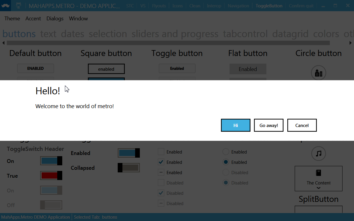
With the latest version of MahApps.Metro it’s now possible to change e.g. the MessageDialog style globally.
<Style TargetType="{x:Type Dialog:MessageDialog}"
       x:Key="NewCustomMessageDialogStyle"
       BasedOn="{StaticResource {x:Type Dialog:BaseMetroDialog}}">
  <Setter Property="Template">
    <!-- the custom template for e.g. MessageDialog -->
  </Setter>
</Style>

<Style TargetType="{x:Type Dialog:MessageDialog}" BasedOn="{StaticResource NewCustomMessageDialogStyle}" />
Hope that helps!