As you already know, the problem arises from a different approach to subpixel calculus between browsers
In Chrome, for instance, borders can have a fractional size, but margins are handled different (as integers).
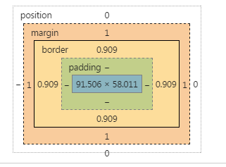
I don’t have documentation about it from the Chrome team, but it’s what can be seen in dev tools:
AFAIK, there is not a way to change that.
Instead, you can transfer the use of the margin in the button to a border.
Since you need to get space for the 1px border of the input, do the same in the button, set a 1px border (instead of a margin), and set it transparent.
The remaining trick is to set the background-clip property to padding box, so that this transparency is not affected by the background
There is another bug in Chrome, the padding expressed in em is not reliable at this level of precision when the browser is zoomed. I changed this in the snippet.
Since we are using the border button to get the dimension ok, we can style the border using instead a inset shadow.
* {
  margin: 0; padding: 0; box-sizing: border-box;
}
button, input, wrapper {
  display: inline-block; border-radius: 3px;
}

.wrapper {
  position: relative;

  width: 60%;
  margin: 1em;
  background-color: #ccc;
}

input {
  border: 1px solid red;
  width: 100%;

  background-color: limegreen;
  line-height: 3em;
/*  padding: 0.75em; */
  padding: 10px;
}

button {
  position: absolute;
  right: 0;
  top: 0;
  bottom: 0;
  border: 1px solid transparent;
  width: 7em;
  margin: 0px;
  background-clip: padding-box;
  box-shadow:  inset 0px 0px 0px 2px  black;
}
<div class="wrapper">
<input type="text">
<button>Test</button>
</div>Another example, where the button has a border. But we need a wrapper around it to get the dimensions ok.
* {
  margin: 0; padding: 0; box-sizing: border-box;
}
button, input, wrapper {
  display: inline-block; border-radius: 3px;
}

.wrapper {
  position: relative;

  width: 60%;
  margin: 1em;
  background-color: #ccc;
}

input {
  border: 1px solid red;
  width: 100%;

  background-color: limegreen;
  line-height: 3em;
/*  padding: 0.75em; */
  padding: 10px;
}

.buttonwrap {
  position: absolute;
  right: 0;
  top: 0;
  bottom: 0;
  border: 1px solid transparent;
  width: 7em;
  margin: 0px;
  background-clip: padding-box;
}
button {
  position: absolute;
  right: 0px;
  top: 0;
  bottom: 0;
  width: 100%;
  border: 2px solid blue;
  margin: 0px;
}
<div class="wrapper">
<input type="text">
<div class="buttonwrap">
<button>Test</button>
</div>
</div>