Adaptive layouts (Responsive layouts) consists of the following three factors:
1. Flexible Layouts:
The divs you use to create your web page layouts need to consist of relative length units.
This means you shouldn’t use fixed widths in your CSS, rather use percentages.
The formula to convert sizes from a design to percentages is (target/context)x100 = result
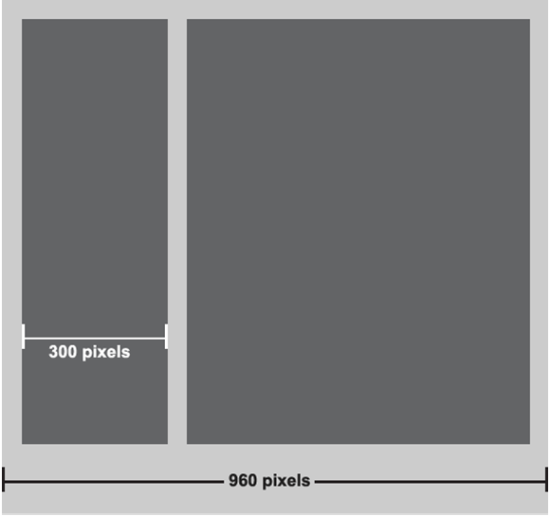
Lets take the picture above as an example of a design. To calculate what the size of the div on the left is going to be calculated like this:
(300px/960px)x100 = 30.25%
The CSS would look something like this:
.leftDiv
{
    width: 30.25%;
    float: left;
}

.rightDiv
{
    width: 65%;
    float: left;
}
For text to automatically resize you can use a unit called VW (ViewWidth)
.myText
{
    font-size: 1vw;
}
This ensures that the text automatically resize relative to the view width.
2.Flexible Media:
Flexible media applies to images, videos and canvasses which automatically resize relative to its parent.
Example:
img, video, canvass
{
    max-width: 100%;
}
This ensures that these elements resize automatically inside its parent.
3. Media Queries:
The next step is to use media queries like you’ve done in your question, these media queries define certain CSS statements for certain screen sizes. I normally use only three media queries for computers screens, tablets and phone screens. Its not necessary to have more than this because the Flexible Layouts and Flexible Media will ensure relative resizing if done correctly.
You may find this helpful: https://developer.mozilla.org/en-US/docs/Web/Guide/CSS/Media_queries