To make a proper answer, I am first going to clarify the requirements :
- images all have the same aspect ratio : 3/2
- images shouldn’t be cropped
- no space between images
- make a mosaic of images
You can have thousands of possibilities to display your images. I am going to make a simple layout that should show you the way to build your own.
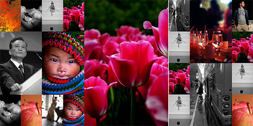
Here is a FANCY FIDDLE of what you can achieve and here is what it looks like :
Code :
body, html {
    width:100%;
    margin:0;
    padding:0;
}
#wrap {
    width:984px;
    height:492px;
}
.big_col, .medium_col, .small_col{
    height:492px;
    float:left;
}
img {
    display:block;
    margin:0;
    padding:0;
    border:none;
    float:left;
}
.big_col {
    width:328px;
}
.medium_col{
    width:164px;
}
.small_col{
    width:82px;
}
.big_img img {
    width:328px;
    height:492px
}
.medium_img img {
    width:164px;
    height:246px;
}
.small_img img {
    width:82px;
    height:123px;
}
<div id="wrap">
<div class="big_col">
<div class="small_img">
<img src="https://picsum.photos/id/241/328/492" alt="" />
<img src="https://picsum.photos/id/147/328/492" alt="" />
<img src="https://picsum.photos/id/258/328/492" alt="" />
<img src="https://picsum.photos/id/237/328/492" alt="" />
</div>
<div class="medium_img">
<img src="https://picsum.photos/id/356/328/492" alt="" />
<img src="https://picsum.photos/id/254/328/492" alt="" />
</div>
<div class="small_img">
<img src="https://picsum.photos/id/156/328/492" alt="" />
<img src="https://picsum.photos/id/175/328/492" alt="" />
<img src="https://picsum.photos/id/132/328/492" alt="" />
<img src="https://picsum.photos/id/197/328/492" alt="" />
</div>
</div>
<div class="big_col">
<img src="https://picsum.photos/328/492" alt="" />
</div>
<div class="small_col small_img">
<img src="https://picsum.photos/id/210/328/492" alt="" />
<img src="https://picsum.photos/id/152/328/492" alt="" />
<img src="https://picsum.photos/id/142/328/492" alt="" />
<img src="https://picsum.photos/id/189/328/492" alt="" />
</div>
<div class="medium_col medium_img">
<img src="https://picsum.photos/id/254/328/492" alt="" />
<img src="https://picsum.photos/id/111/328/492" alt="" />
</div>
<div class="small_col small_img">
<img src="https://picsum.photos/id/198/328/492" alt="" />
<img src="https://picsum.photos/id/201/328/492" alt="" />
<img src="https://picsum.photos/id/286/328/492" alt="" />
<img src="https://picsum.photos/id/145/328/492" alt="" />
</div>
</div>First step : think, calculate and think again
First : To make it simple let’s say your images can have 3 sizes (I changed the image size by 1 px to make calculations easier) :
- big :
328*492px - medium, 1/2 of big :
164*246px - small, 1/4 of big :
82*123px
Second : As your images are all portraits and your container has the same height as the big image, you will have to work with 492px heigh columns that can have 3 widths :
- big :
328pxwide, they can display all size images - medium :
328/2 = 164pxwide, they can display medium and small images - small :
327/4 = 82pxwide, they can only display small images
Third : How many columns and what image sizes? This is up to you, you will have to make a choice according to the total width of your container and the number of images you want to display.
But in your fiddle, the container (._pictures1) has a 935px width which will be impossible to achieve with the column widths chosen just before.
935/82 = 11.4024...
The closest you can get is 82*12 = 984px wide container.
You will either have to change the width of the container either change the sizes of images and columns to fit your initial width.
Or (spoiler) you can work with percentages, this can be an alternative especialy if you need your layout to be responsive but this can become complicated and I am trying to make things simple.
As I am sure you are curious and want to check it out, here is an example layout in a
Responsive mosaic of image fiddle
Code snippet :
body, html {
    width:100%;
    margin:0;
    padding:0;
}
#wrap {
    width:100%;
}
.big_col, .medium_col, .small_col{
    float:left;
}
img {
    height:auto;
    display:block;
    margin:0;
    padding:0;
    border:none;
    float:left;
}
.big_col {
    width:25%;
}
.medium_col{
    width:12.5%;
}
.small_col{
    width:6.25%;
}

.small_col img{
    width:100%;
}
.medium_col>img {
    width:100%;
}
.medium_col .small_img img {
    width:50%;
}
.big_col .small_img img {
    width:25%;
}
.big_col .medium_img img {
    width:50%;
}
.big_col img {
    width:100%;
}
<div id="wrap">
<div class="big_col">
<div class="small_img">
<img src="https://picsum.photos/id/241/328/492" alt="" />
<img src="https://picsum.photos/id/147/328/492" alt="" />
<img src="https://picsum.photos/id/258/328/492" alt="" />
<img src="https://picsum.photos/id/237/328/492" alt="" />
</div>
<div class="medium_img">
<img src="https://picsum.photos/id/356/328/492" alt="" />
<img src="https://picsum.photos/id/254/328/492" alt="" />
</div>
<div class="small_img">
<img src="https://picsum.photos/id/156/328/492" alt="" />
<img src="https://picsum.photos/id/175/328/492" alt="" />
<img src="https://picsum.photos/id/132/328/492" alt="" />
<img src="https://picsum.photos/id/197/328/492" alt="" />
</div>
</div>
<div class="big_col">
<img src="https://picsum.photos/328/492" alt="" />
</div>
<div class="small_col small_img">
<img src="https://picsum.photos/id/210/328/492" alt="" />
<img src="https://picsum.photos/id/152/328/492" alt="" />
<img src="https://picsum.photos/id/142/328/492" alt="" />
<img src="https://picsum.photos/id/189/328/492" alt="" />
</div>
<div class="medium_col medium_img">
<img src="https://picsum.photos/id/254/328/492" alt="" />
<img src="https://picsum.photos/id/111/328/492" alt="" />
</div>
<div class="small_col small_img">
<img src="https://picsum.photos/id/198/328/492" alt="" />
<img src="https://picsum.photos/id/201/328/492" alt="" />
<img src="https://picsum.photos/id/145/328/492" alt="" />
<img src="https://picsum.photos/id/198/328/492" alt="" />
</div>
</div>Next step : design the layout
Use a pen, photoshop, or any other tool that suits you, if you are realy good you can even use your brain to mentaly represent the layout you want.
I designed the image you can see at the bigininng of the answer.
As I said before there are many layout posibilities (number of columns and sizes of images in those columns) so for the example I chose 2 big columns 1 medium and 2 small ones
328*2+164+82*2 = 984px ( = width of container so it can fit!)
Last step : start coding!
You can see the result in this
FIDDLE
This layout is based on floats so we need to define in the width, height of container, columns, images so they can all fit next to each other nicely (as we have already thought about that with calculation and design, it’s easy).
body, html {
    width:100%;
    margin:0;
    padding:0;
}
#wrap {
    width:984px;
    height:492px;
}
.big_col, .medium_col, .small_col{
    height:492px;
    float:left;
}
img {
    display:block;
    margin:0;
    padding:0;
    border:none;
    float:left;
}
.big_col {
    width:328px;
}
.medium_col{
    width:164px;
}
.small_col{
    width:82px;
}
.big_img img {
    width:328px;
    height:492px
}
.medium_img img {
    width:164px;
    height:246px;
}
.small_img img {
    width:82px;
    height:123px;
}
<div id="wrap">
<div class="big_col">
<div class="small_img">
<img src="https://picsum.photos/id/241/328/492" alt="" />
<img src="https://picsum.photos/id/147/328/492" alt="" />
<img src="https://picsum.photos/id/258/328/492" alt="" />
<img src="https://picsum.photos/id/237/328/492" alt="" />
</div>
<div class="medium_img">
<img src="https://picsum.photos/id/356/328/492" alt="" />
<img src="https://picsum.photos/id/254/328/492" alt="" />
</div>
<div class="small_img">
<img src="https://picsum.photos/id/156/328/492" alt="" />
<img src="https://picsum.photos/id/175/328/492" alt="" />
<img src="https://picsum.photos/id/132/328/492" alt="" />
<img src="https://picsum.photos/id/197/328/492" alt="" />
</div>
</div>
<div class="big_col">
<img src="https://picsum.photos/328/492" alt="" />
</div>
<div class="small_col small_img">
<img src="https://picsum.photos/id/210/328/492" alt="" />
<img src="https://picsum.photos/id/152/328/492" alt="" />
<img src="https://picsum.photos/id/142/328/492" alt="" />
<img src="https://picsum.photos/id/189/328/492" alt="" />
</div>
<div class="medium_col medium_img">
<img src="https://picsum.photos/id/254/328/492" alt="" />
<img src="https://picsum.photos/id/111/328/492" alt="" />
</div>
<div class="small_col small_img">
<img src="https://picsum.photos/id/198/328/492" alt="" />
<img src="https://picsum.photos/id/201/328/492" alt="" />
<img src="https://picsum.photos/id/145/328/492" alt="" />
<img src="https://picsum.photos/id/198/328/492" alt="" />
</div>
</div>