You’re asking this:
Can I have a varying number of columns per row in a CSS Grid?
But then you’re saying this:
Is this possible via CSS Grid/Flexbox to horizontally center 2 columns in the 2nd row?
It looks like you’re stuck in a classic XY Problem: You’re focusing on your attempted solution rather than your actual problem.
Yes, it is possible to center columns (and grid items, and content) in CSS Grid. (See various methods here: Centering in CSS Grid)
No, it’s not possible to have a varying number of columns per row in a CSS Grid, or any grid for that matter. Otherwise, you don’t have a grid.
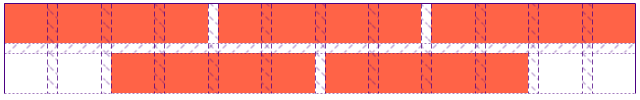
Since appearance is often all that matters in a layout, you can build something that looks like three “columns” in the first row and two “columns” in the second row – centered – using CSS Grid.
In my example below, I’ve divided the horizontal space in the grid container among 12 columns. I’ve then used Grid’s line-based placement features to position and size the items.
.grid {
  display: grid;
  grid-template-columns: repeat(12, 1fr);
  grid-auto-rows: 40px;
  grid-gap: 10px;
}

.col:nth-child(-1n + 3) {
  grid-column: span 4;
}
.col:nth-last-child(2) {
  grid-row-start: 2;
  grid-column: 3 / span 4;
}
.col:nth-last-child(1) {
  grid-row-start: 2;
  grid-column: 7 / span 4;
}
.col {
  background-color: tomato;
}
<div class="grid">
<div class="col"></div>
<div class="col"></div>
<div class="col"></div>
<div class="col"></div>
<div class="col"></div>
</div>Here’s what it looks like using Firefox DevTools: