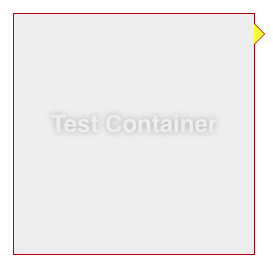
You actually have to fake it with two triangles….
.container {
    margin: 15px 30px;
    width: 200px;
    background: #fff;
    border: 1px solid #a00;
    position: relative;
    min-height: 200px;
    padding: 20px;
    text-align: center;
    color: #fff;
    font: bold 1.5em/180px Helvetica, sans-serif;
    text-shadow: 0 0 1px #000;
}

.container:after,
.container:before {
    content: '';
    display: block;
    position: absolute;
    left: 100%;
    width: 0;
    height: 0;
    border-style: solid;
}

.container:after {
    top: 10px;
    border-color: transparent transparent transparent #fdd;
    border-width: 10px;
}

.container:before {
    top: 9px;
    border-color: transparent transparent transparent #a00;
    border-width: 11px;
}