The native dashed border property value does not offer control over the dashes themselves… so bring on the border-image property!
Brew your own border with border-image
Compatibility: It offers great browser support (IE 11 and all modern browsers). A normal border can be set as a fallback for older browsers.
Let’s create these
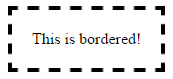
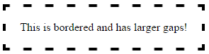
These borders will display exactly the same cross-browser!
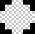
Step 1 – Create a suitable image
This example is 15 pixels wide by 15 pixels high and the gaps are currently 5px wide. It is a .png with transparency.
This is what it looks like in photoshop when zoomed in:
This is what it looks like to scale:

Controlling gap and stroke length
To create wider / shorter gaps or strokes, widen / shorten the gaps or strokes in the image.
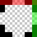
Here is an image with wider 10px gaps:
 correctly scaled =
Step 2 – Create the CSS — this example requires 4 basic steps
-
Define the border-image-source:
border-image-source:url("http://i.stack.imgur.com/wLdVc.png"); -
Optional – Define the border-image-width:
border-image-width: 1;The default value is 1. It can also be set with a pixel value, percentage value, or as another multiple (1x, 2x, 3x etc). This overrides any
border-widthset. -
Define the border-image-slice:
In this example, the thickness of the images top, right, bottom and left borders is 2px, and there is no gap outside of them, so our slice value is 2:
border-image-slice: 2;The slices look like this, 2 pixels from the top, right, bottom and left:
-
Define the border-image-repeat:
In this example, we want the pattern to repeat itself evenly around our div. So we choose:
border-image-repeat: round;
Writing shorthand
The properties above can be set individually, or in shorthand using border-image:
border-image: url("http://i.stack.imgur.com/wLdVc.png") 2 round;
Complete example
Note the border: dashed 4px #000 fallback. Non-supporting browsers will receive this border.
.bordered {
  display: inline-block;
  padding: 20px;
  /* Fallback dashed border
     - the 4px width here is overwritten with the border-image-width (if set)
     - the border-image-width can be omitted below if it is the same as the 4px here
  */
  border: dashed 4px #000;

  /* Individual border image properties */
  border-image-source: url("http://i.stack.imgur.com/wLdVc.png");
  border-image-slice: 2;
  border-image-repeat: round;

  /* or use the shorthand border-image */
  border-image: url("http://i.stack.imgur.com/wLdVc.png") 2 round;
}


/*The border image of this one creates wider gaps*/
.largeGaps {
  border-image-source: url("http://i.stack.imgur.com/LKclP.png");
  margin: 0 20px;
}
<div class="bordered">This is bordered!</div>
<div class="bordered largeGaps">This is bordered and has larger gaps!</div>