Ribbon shape using CSS Clip Path:
.bookmarkRibbon {
  width: 100px;
  height: 60px;
  background: blue;
  clip-path: polygon(0% 0%, 100% 0%, calc(100% - 20px) 50%, 100% 100%, 0% 100%);
}
<div class="bookmarkRibbon"></div>Pointing down:
.bookmarkRibbon {
  width: 60px;
  height: 100px;
  background: blue;
  clip-path: polygon(0% 0%, 100% 0%, 100% 100%, 50% calc(100% - 20px), 0% 100%, 0% 0%);
}
<div class="bookmarkRibbon"></div>Ribbon shape using CSS border
To help you visualize the logic step-by-step, so you can apply it easily on any side:
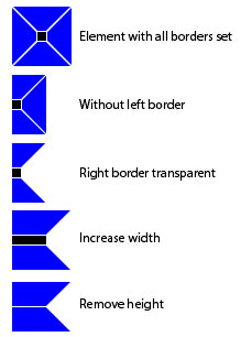
.bookmarkRibbon {
  border:       30px solid blue;        /* All borders set */
  border-left:  0;                      /* Remove left border */
  border-right: 20px solid transparent; /* Right transparent */
  width:        100px;                  /* Increase element Width */
}
<div class="bookmarkRibbon"></div>