Short Answer
Switch from flex: 1 to flex: auto.
Explanation
The flex-grow property factors in two key pieces of data:
- The free space in the row / column where it is being used.
- The value of the
flex-basisproperty.
Distribution of Free Space
The flex-grow property distributes free space in the container among flex items in the same line.
If there is no free space, flex-grow has no effect.
If there is negative free space (i.e., the total length of flex items is greater than the length of the container), then flex-grow has no effect and flex-shrink comes into play.
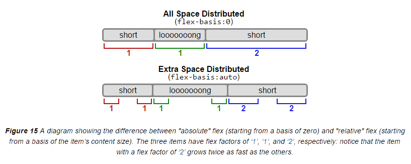
The flex-basis factor
When flex-basis is 0, flex-grow ignores the size of the content in flex items and treats all space on the line as free space.
This is absolute sizing. All space on the line is distributed.
When flex-basis is auto, the size of the content in flex items is first deducted to determine the free space in each item. flex-grow then distributes the free space among items (based on each item’s flex-grow value).
This is relative sizing. Only extra space on the line is distributed.
Here’s an illustration from the spec:
Examples:
flex: 1(absolute sizing)
This shorthand rule breaks down to: flex-grow: 1 / flex-shrink: 1 / flex-basis: 0
Applied to all flex items, this will make them equal length, regardless of content. (Note that in some cases an override of default minimum sizing will be necessary for this effect to occur.)
flex-grow: 1(relative sizing)
This rule by itself will factor in both content size and available space, because the default value for flex-basis is auto.
flex: auto(relative sizing)
This shorthand factors in both content size and available space because it breaks down to:
flex-grow: 1flex-shrink: 1flex-basis: auto
More variations here: 7.1.1. Basic Values of flex
additional keywords for search: difference between flex-basis auto 0 flex 1 auto