Eventually it will be, using shaders. See the W3C Docs on Filters.
At the moment, what is possible for instance is:
-webkit-filter: grayscale; /*sepia, hue-rotate, invert....*/
-webkit-filter: brightness(50%);
See
- David Walsh on CSS Filters
- Stackoverflow: apply a rose tint…:
- W3C Filter Effects 1.0 Docs – 38.2.5. Other uniform variables: the CSS shaders parameters
Update:
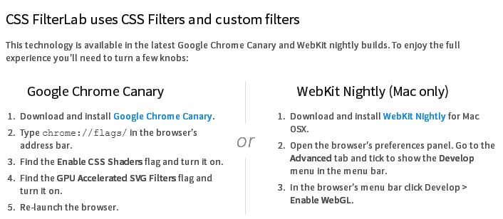
Adobe released its HTML5 based CSS Filter Labs with support for custom filters (Shaders) on supported browsers: